

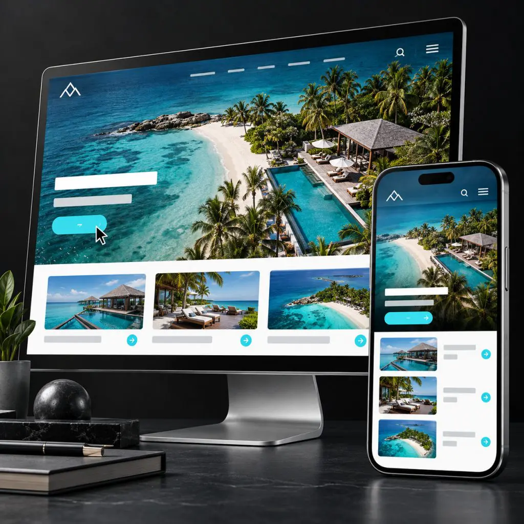
A campaign landing page should continue the conversation the ad started. If the ad promises one thing and the page opens with an unrelated message, the visitor has to do extra work to understand whether they arrived in the right place.
Before increasing spend, walk through the page as someone who knows nothing about the business beyond the ad. This campaign landing-page checklist focuses on that experience—not a universal layout formula.
Match the promise above the fold
Use the opening headline, supporting copy, and image to confirm the offer. Keep terminology consistent with the campaign. If the ad promotes one service, do not force visitors to search a general menu to find it.
Make the audience and next step clear. Someone should understand whether they are requesting information, buying a product, applying, or booking a conversation. Avoid a button label that conceals the commitment.
Answer the objection that matters
Identify the question most likely to stop a suitable customer: scope, suitability, timing, price structure, trust, or what happens after the inquiry. Address it with useful information, not another slogan.
Use genuine proof relevant to the offer. Do not add fabricated urgency, invented results, or testimonials unrelated to the decision. If a claim requires qualification, make that qualification readable rather than hiding it in tiny type.
Remove competing priorities
A landing page can include navigation or related information when those help the customer. The goal is not to remove every link mechanically. The goal is to avoid several unrelated calls to action competing with the intended decision.
Review visual emphasis. The strongest heading, image, and button should support the same offer. Decorative motion or oversized graphics should not make essential information harder to reach.
Test the form and confirmation
- Ask for information the next step actually needs.
- Explain required fields and provide clear error messages.
- Test with the mobile keyboard open.
- Confirm the submission reaches the right owner.
- Show a useful confirmation and explain what happens next.
- Verify that the recorded conversion corresponds to a successful action, not just a button click.
If the destination is a booking calendar or external checkout, include that step in the test. The journey does not end at the edge of your own website.
Check measurement before launch
Use a labeled test and verify the resulting event and CRM record. Keep testing traffic distinguishable where your setup permits. Review consent and privacy requirements with the appropriate owner before deploying tracking changes.
After launch, compare inquiry volume with fit, appointment attendance, and sales progression. A page that produces more low-quality submissions may look successful in an ad dashboard while creating more work for the business.
Improve one meaningful hypothesis at a time
Choose a change with a reason: clearer offer language, more relevant proof, or a simpler qualification step. Define what would count as an improvement. Avoid declaring a winner from a tiny sample or changing every major element at once without a way to interpret the result.
Paid media and web design and conversion should work together. The click is an opportunity. The page and follow-up determine what happens next.