

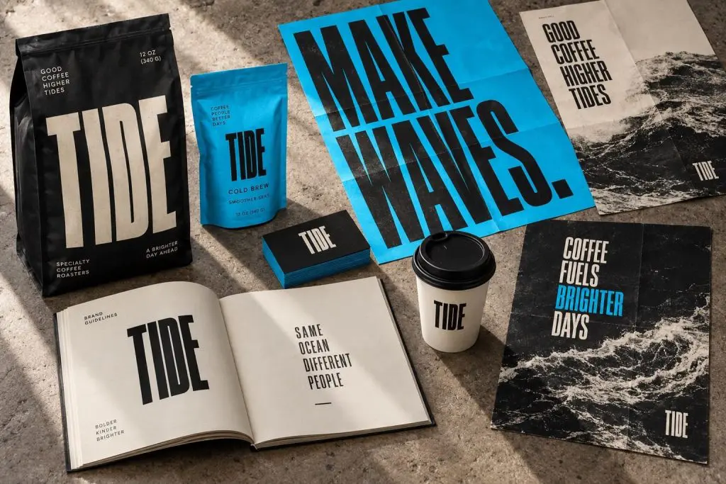
Brand consistency does not mean making every piece of creative identical. It means giving customers enough familiar signals to recognize the same business across different situations. A website, campaign, proposal, and package can each do a different job while sharing a coherent identity.
The challenge is usually not a shortage of assets. It is a shortage of decisions about how those assets should be used. A folder full of logos and a list of color codes will not resolve conflicting messages or help a team build a strong campaign.
Separate the constants from the flexible parts
Start by deciding what should stay recognizable: the core promise, logo treatment, typography, color relationships, and general approach to imagery. Then decide what can change with the purpose: composition, campaign headline, photography subject, and format.
A seasonal promotion can feel energetic without adopting a completely different visual personality. A technical sales document can be restrained without looking disconnected from the website. Consistency gives the work a shared foundation; it should not flatten useful variation.
Build a small system people can use
- Define the message hierarchy: what the audience needs to understand first, second, and third.
- Show approved logo versions and clear-space rules in actual applications.
- Provide typography examples for headlines, body text, labels, and mobile layouts.
- Explain how to select images—not just where to download them.
- Create editable templates for recurring work such as proposals, email headers, and campaign posts.
Include examples of common mistakes. Showing the difference between an intentional accent color and an unreadable text treatment can be more useful than adding another page of abstract rules.
Audit touchpoints side by side
Place screenshots of your homepage, a service page, a recent ad, an email, and a proposal beside one another. Look for changes in tone, promises, hierarchy, and image style. Ask whether someone could recognize the business if the logo were temporarily covered.
Do not fix everything just because it looks different. Identify which differences are purposeful and which create confusion. An ad may need a stronger immediate hook than a detailed proposal. Both should still support the same underlying offer.
Make ownership clear
Decide who maintains the source files, approves important departures, and retires old assets. Store working templates somewhere the team can actually find them. Name files plainly and make the current version obvious.
When the system changes, communicate the reason and update the highest-impact materials first. Expecting everyone to discover a new guideline buried in a shared folder is not a rollout plan.
Judge consistency by customer clarity
The goal is not visual policing. The goal is to make the business easier to recognize, understand, and trust. If a rule makes essential information harder to read, reconsider the application. A useful system supports the customer’s decision and the team’s daily work.
Our brand and creative work builds those systems across real touchpoints. Start with the difference between your logo and your brand if the underlying message still needs direction.